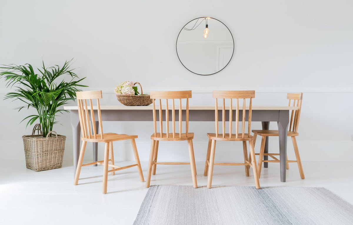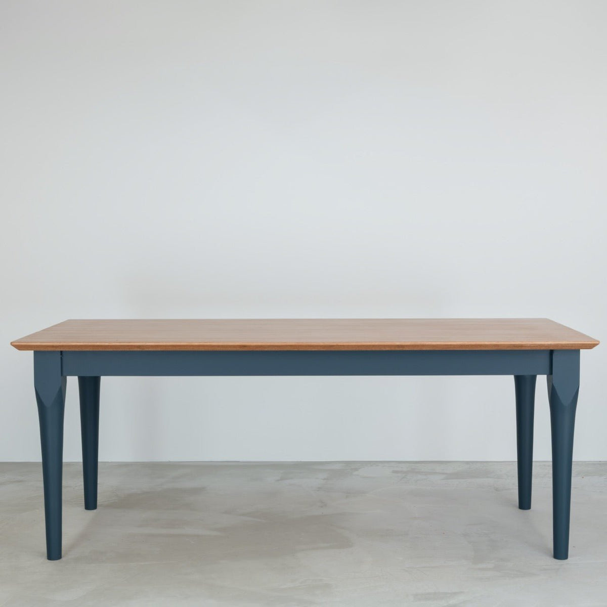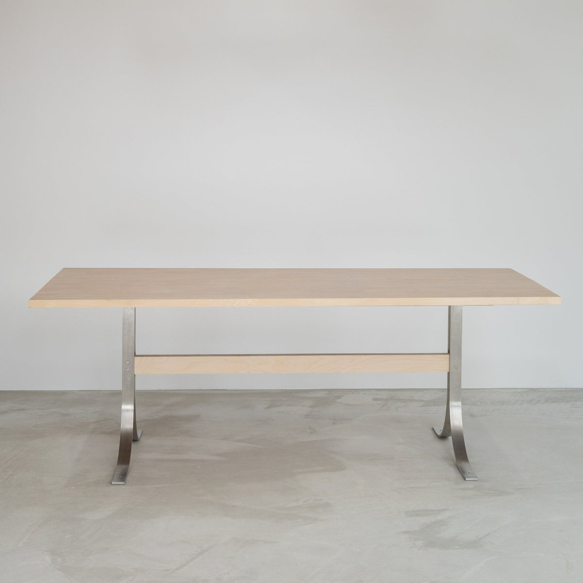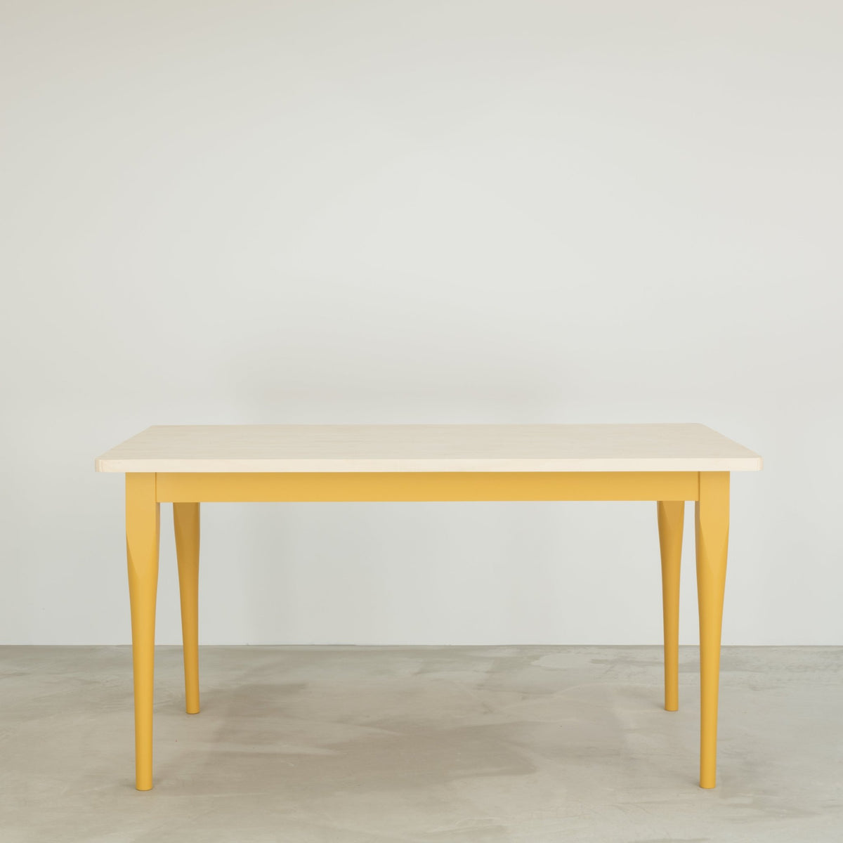
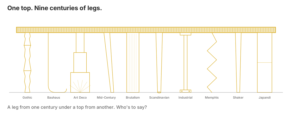
A note before we start, which is really the point of the whole article. Who's to say, anyway? What follows are guidelines, not laws, and we'd be the first to say that it doesn't matter what a table is called if you like it. If you like it, do it. That, as it happens, is why we enjoy designing bespoke tables: nobody has to choose from a catalogue, and the freedom to put a leg from one century under a top from another is most of the pleasure. We would say that, of course. We design them.
Still, somewhere in every conversation about a new table, a style gets named. Mid-century. Japandi. Scandinavian, or just 'a bit Scandi'. It's useful shorthand, and it works right up to the moment it turns into a rule, when a room has to pass an exam before a table is allowed into it.
We'd rather treat design movements as a vocabulary. Each one began with a group of people who looked at the furniture around them and decided it was wrong: too fussy, too expensive, too plain, too polite. What they made in response became a look, and the look got a name. Knowing the names helps you say what you want. It shouldn't tell you what you're allowed to want.
So here are ten of them, in rough order of age. For each one we've tried to tell the story first, because the look only makes sense once you know where it came from, and then we answer the questions people actually ask us: is there a design of ours to start from, does an Edge Grain Ply top belong in the room, and which colours work. A word on that first question. The designs on our site are starting points, not a catalogue. Every table is designed for its room, and when none of them is right we start from a blank sheet, so 'no ready-made design' never means no. Along the way, it should also become clear where Design & Irony fits in.
In this article: ten styles, each with our one-word verdict.
Gothic - dramaBauhaus - boldArt Deco - geometricMid-Century Modern - plywoodBrutalism - rawScandinavian - freshIndustrial - warehouseMemphis - radicalShaker - kitchensJapandi - naturalAnd one moreQuestions people ask
Gothic: pointed, dark and proud of it
Our word for it: drama.
The style of the medieval cathedral, revived by the Victorians: pointed arches, carved dark oak, rich colour, and no interest whatsoever in being quiet.
Gothic is the oldest style here by several centuries, and it began not with furniture but with buildings. From the twelfth century on, the masons of northern France worked out that a pointed arch could carry more weight than a round one, and that if you braced the walls from outside with flying buttresses you could make them thinner and fill them with glass. The cathedrals that followed - Chartres, Amiens, Canterbury - were taller, lighter and more dramatic than anything built before, and that drama is the thing the word Gothic has carried ever since.
It came back indoors six hundred years later, in Victorian Britain, for a reason that will sound familiar. The factories of the 1840s were turning out cheap, machine-made furniture in quantities nobody had seen before, and a young architect called Augustus Pugin thought it was dishonest: ornament stuck on for show, with nothing underneath. His answer was to look back to the Middle Ages, when, as he saw it, people had built things properly and shown how they were built. The Gothic Revival he started gave us the Houses of Parliament, a great many churches, and dining rooms full of carved dark oak, pointed arches on the chair backs, velvet, damask and deep colour. Nothing in a Gothic room is trying to be quiet. Pugin would have loathed our tables, and we'd have liked him anyway.
That is why none of our listed designs fits it, and we'd rather say so than stretch the point. The Sand comes closest, because a turned leg is a traditional leg, but Gothic wants carving, mouldings and weight, and nothing on our site is built that way. The top is an even poorer match. Gothic is about the surface being worked - carved, moulded, polished dark - and an Edge Grain Ply top is the opposite idea: the surface is the structure, striped and matt, and in Birch or Poplar as pale as timber gets. Put one on carved legs and you've made a table that argues with itself.
That said: who's to say? If someone wants a striped top on carved legs, we truly would love to do it, and would be honoured. Some of the best tables start as an argument.

If one of our tables is going into a room with Gothic leanings, let the legs do the talking and go for the jewel colours the Victorians loved: Hague Blue, a bottle green like Farrow & Ball's Studio Green, or Little Greene's Baked Cherry, which is as close to a garnet as a tin of paint gets. Meranti on top if you want to lean in.
Bauhaus: form follows function
Our word for it: bold.
A German design school of the 1920s that stripped furniture back to its job and let the materials show: steel, glass, plain geometry and primary colour.
Germany after the First World War was broke, and its houses were still full of the carved, upholstered, over-decorated furniture of the century before: expensive to make, and only ever meant for people with money. In 1919 an architect called Walter Gropius opened a school in Weimar, the Bauhaus, to do something about it. His idea was that good design should be available to everyone, and that the way to get there was to stop decorating things and start asking what each object was for. If a chair's job was to hold a person up, its shape should come from that job and nothing else; if steel did the job better than carved oak, use steel, and don't disguise it.
That is why Bauhaus rooms look the way they do. The steel and glass are there because they were modern, cheap and honest; the plain geometry is what's left when the ornament goes; and the primary colours come from the school's painters, Kandinsky and Klee among them, who used red, yellow and blue the way a writer uses punctuation: sparingly, and to make a point. Marcel Breuer, who taught there, bent tubular steel into a chair after looking at his bicycle's handlebars, which tells you most of what you need to know about the attitude. The Nazis closed the school in 1933 and its teachers scattered across the world, which is largely why the look is now everywhere.
Of our designs, the Sving is the one a Bauhaus studio might have drawn: arched stainless steel legs doing exactly one thing, a plain top, and nothing decorative anywhere.

The top suits it for the right reason, too. The Bauhaus liked materials in their raw state and structure you could see, and every line on an Edge Grain Ply top is a layer of the board. The pattern isn't printed; it's the construction.
For colour, be primary and not shy about it: Atomic Red, Marigold or Hicks' Blue on painted legs under a Birch top, to keep the whole thing crisp. Or brushed stainless steel and no paint at all, which Gropius would probably have preferred. He'd also have preferred us not to charge for it, and there we part company.
Art Deco: the glamour years
Our word for it: geometric.
The glamour of 1920s Paris and 1930s New York: gloss, chrome, sunbursts, stepped forms and exotic veneers, all of it made to be noticed.
If the Bauhaus was Germany's answer to a lost war, Art Deco was France's answer to a won one. Paris in the 1920s had money again, and a taste for showing it. The style takes its name from a huge exhibition of decorative arts held there in 1925, where the French set out to prove they still led the world in making fine things, and in a sense they did. The look borrowed from everywhere at once: the geometry of Cubism, the stepped shapes of Aztec temples, the gold of Tutankhamun's tomb, opened in 1922 and front-page news for years, and the sheer speed of the new machines - cars, liners, aeroplanes - which gave it the sunbursts and streamlines.
In furniture the master was Émile-Jacques Ruhlmann, who made pieces in macassar ebony, ivory and sharkskin for clients who could spend a year's wages on a cabinet. The style then crossed the Atlantic and got bigger: the crown of the Chrysler Building, the lobby of the Empire State, and, back in Britain, the cinemas and lidos of the 1930s and the Hoover Building on the A40, which most Londoners have driven past without knowing it was a vacuum-cleaner factory. Where the Bauhaus wanted to take away, Deco wanted to add: gloss, chrome, mirror, exotic veneers, and a pattern on everything. It rewards the eye and never intends to be understated.
Which is why, for the second and last time in this article, there is no listed design to start from. Deco furniture is about rich veneers and gleaming hardware, and nothing on our site has either. Poise Corners has the stainless steel but not the gloss, and gloss is most of the point. The top fares no better: Deco surfaces are smooth, polished and figured, and ours are striped and matt. Two good ideas, pointing in different directions.
Who's to say, though. A stepped plinth under an Edge Grain Ply top would be an interesting conversation, and we like interesting conversations.

If a table of ours is going into a Deco room anyway, go dark and let the room do the shining: Meranti on top, with Charcoal, Railings or a deep teal like Inchyra Blue on the legs, and keep the brass for the lamps, the taps and, if the room is doing Deco properly, the bath.
Mid-Century Modern: the plywood movement
Our word for it: plywood.
The light, curved, warm furniture of the twenty-five years after the Second World War, made from the materials the war had developed, plywood above all.
The Second World War did two things for furniture. It developed a set of materials in a hurry - plywood, aluminium, plastics, resin glues - for aircraft, boats and field hospitals; and when it ended it left millions of people needing to furnish small new homes on small budgets. The designers who came of age in the twenty-five years after 1945 took the wartime materials and used them to make furniture that was light, curved, warm and affordable, and that is what Mid-Century Modern means. The rooms it belongs in have big windows, natural wood against glass and steel, neutral walls and one bold colour. Form still follows function, as the Bauhaus had taught and its exiled teachers were now teaching in America, but it is allowed to smile.
It was also, more than any other, the movement of bent and moulded ply, and we'd be lying if we said that didn't interest us. Alvar Aalto was bending birch ply into stools and armchairs in Finland by 1932. Marcel Breuer, after the Bauhaus closed, designed the Isokon chairs in moulded birch in London in 1936. Gerald Summers cut and bent an entire armchair from a single sheet in 1934. Charles and Ray Eames moulded it into leg splints for the US Navy in 1942, learning as they went, and then into the chairs that defined the era; Arne Jacobsen's Ant and Series 7 followed in the fifties and are still the most-sold plywood furniture on earth, several of them probably being sat on in a meeting near you right now. If you wonder why there was so much of the stuff about, the de Havilland Mosquito, a wartime aircraft with a birch-ply fuselage, is most of the answer.
Every one of those designers bent the sheet and showed its edge as a thin stripe, a trim. We cut it into strips, turn each one on its edge, and make the stripe the whole surface. Same material, opposite decision.
So yes, more than one of our designs fits. The Lamella and The Edgeform have the slim tapered legs the era loved; The Folde has the warmer, rounder version.

And it would be strange if the top didn't belong. This is the one movement where plywood was the hero material, and an Edge Grain Ply top is the same material with nothing to hide.
For colour, think of a living room in 1958: Mid Bronze Green, a mustard like India Yellow, a teal like Little Greene's Dock Blue, or an olive like Farrow & Ball's Bancha on the legs, with Poplar or Meranti on top for warmth. One strong colour, and let the rest of the room stay calm.
Brutalism: structure on show
Our word for it: raw.
Post-war building that left its materials raw and its structure on show, first out of necessity and then out of conviction.
Britain in 1950 had bombed cities, a housing shortage and no money. The architects asked to rebuild it had to build fast and cheap, and the fastest, cheapest material was concrete poured into timber moulds and left exactly as it came out, grain marks and all. The French architect Le Corbusier had a name for concrete left like that, béton brut, raw concrete, and from it the buildings got theirs: Brutalism. What began as a necessity became a conviction. If you can't afford decoration, make a virtue of not having any; leave the materials raw, let the structure show, and trust that honesty to be enough. The Barbican in London is the version you can walk around, and the National Theatre is the version you can argue about.
People still do argue about it, which is partly why it's back. After decades of being called ugly, Brutalism has been rediscovered by a generation who find its honesty restful: nothing is pretending, nothing is hidden, and the textures of concrete, brick and timber do the work that ornament used to do. In furniture that means simple geometry, exposed construction, and no apology.
Of our designs, this is the Acuity's home ground. Its legs and frame are cut from the same Edge Grain Ply as the top, so the whole table is one material and the construction is visible from every side. The Plano, with its plain 90mm square leg, is the quieter cousin.

And of all ten movements here, this is where the top works best. 'Structure clearly shown' could be the material's job description: every layer of the board is on the surface, and the surface is the structure. Brutalism in a kitchen, without the concrete.
Colour, ideally, none. An all-ply Acuity with no paint is the honest answer. If it must have some, keep to the concrete end of the chart: black, Down Pipe, or Little Greene's Scree. If you want more than that, you may be in the wrong section.
Scandinavian: calm, pale and useful
Our word for it: fresh.
Modernism done in pale wood by the Nordic countries from the 1930s on: simple, warm, useful, and respectful of the material.
The Nordic countries came to modernism by a gentler road. The same ideas arrived from Germany in the 1930s, but Sweden, Denmark and Finland also had long winters, small towns, good forests and a craft tradition nobody had any wish to throw away. So where the Bauhaus reached for steel, the Scandinavians reached for birch, beech and pine, and made the new plain shapes in warm pale wood instead. Alvar Aalto's bent-birch furniture of the early thirties is the founding text; the Danish chairmakers of the fifties, Hans Wegner and Finn Juhl among them, wrote the rest. The result was modern furniture that felt humane rather than industrial, and it suited the Scandinavian idea of home as a refuge from the dark: light, uncluttered, comfortable, and made to last.
It is now the most copied style in the world, which is both a compliment and a problem. 'Scandinavian' covers everything from a Finnish masterpiece to a flat-pack bookcase, and most of what gets sold under the name has kept the paleness and lost the point, which was respect for the material. A hex key is not a design philosophy.
Of our designs, The Lamella and The Edgeform fit best, both on slim tapered legs, and you'll find them in the Scandi & Contemporary collection.

The top fits, with a note. The material is right: our Birch top is birch ply, the same family Aalto used, and honesty of materials was a Scandinavian idea before it was anyone else's. The pattern is the question. A striped top is a lot of pattern for a style built on calm, so a Birch top on pale legs keeps it quiet, and a Meranti top makes it something else, which might be exactly what you want.
Colours, pale and few: Bone China Blue, a soft grey-green like Farrow & Ball's Mizzle, or a chalky pink like Setting Plaster on the legs, if any colour at all; otherwise leave the timber alone and let the top be the only pattern in the room.
Industrial: the warehouse look
Our word for it: warehouse.
The look of the converted warehouse: brick, steel and reclaimed timber, and nothing pretending to be new.
Industrial isn't a movement with a manifesto. It's a habit that became a style. In the 1960s and 70s, as manufacturing left the centres of New York and then London, it left behind acres of empty factories and warehouses with high ceilings, big windows and very low rents. Artists moved in first, because they needed the space and could put up with the pipes; then everyone else followed, because the artists had made it look good. The people who lived in those lofts kept the brick, the steel columns, the ducting and the bare bulbs, partly because it was cheaper than covering them up and partly because, once you'd looked at them for a while, you didn't want to. The furniture that suited the rooms was the furniture that looked as if it had always been there: scaffold boards, black steel, reclaimed timber, and nothing pretending to be new.
That is the look as sold now, in a thousand bars and kitchen showrooms, and most of it is a costume. The real thing is simpler: metal against wood, materials being what they are, and ideally not a filament bulb within fifty feet.
Of our designs, Poise Corners and Sving fit, both on stainless steel, and cleaner than the style usually gets. We don't do black-painted steel or scaffold boards, and we've never called a table of ours industrial; what we share with the look is the honest pairing of stainless steel and timber. Think of it more as a nod to industrial than the look itself.

The top belongs for the same reason. Industrial is about materials being what they are, and an Edge Grain Ply top is unmistakably what it is. The layers do the job the brick does.
For colour, brushed stainless steel and a Meranti top, which is as dark and rich as the style wants without a single tin of black paint. If the legs are to be painted, Lamp Black or a brick red like Little Greene's Tuscan Red is where the look lives. See the Metal Leg collection.
Memphis: the one that broke the rules on purpose
Our word for it: radical.
A group of Milan designers in the early 1980s who broke every rule of good taste on purpose, in clashing colour and pattern, and ended up winning.
By 1980, modernism had won so completely that it had become a kind of good manners. Every serious piece of furniture was plain, functional and in a tasteful neutral, and a group of young designers in Milan had had enough. On a December evening in 1980, at the flat of Ettore Sottsass - then in his sixties, and the most respected designer in Italy - they decided to make furniture that broke every rule they'd been taught, and named the group after the Bob Dylan song that happened to be playing. What they showed in Milan the following September was deliberately shocking: bookcases in clashing primary colours, laminates printed with squiggles, tables on legs that made no structural sense at all. It was meant to annoy, and it did. Critics hated it, the public couldn't afford it, and within a few years the group had dissolved.
And then it won anyway. Forty years on, Memphis is the style every other movement secretly wishes it had the nerve for, and you can see its colours and squiggles in half the shops on the high street without anyone remembering where they came from. That is the fate of every good joke.
None of our listed designs fits it, and we're not sure anyone's does; Memphis was a group of one-offs, not a range. But of all ten movements here, it's the one that shares our reflex: take the material everyone else uses politely and do something with it they weren't expecting. We should be honest that we're nowhere near as radical - our tables still look like tables, and we'd like to keep it that way - but the instinct is the same.
The top, oddly, works. The stripe is a pattern, and Memphis loved a pattern. An Edge Grain Ply top on legs in three colours that shouldn't go together would be entirely in the spirit, and we'd be delighted to be asked.

Colours: all of them, at once. Atomic Red, India Yellow and Bone China Blue on three different legs - or Marigold, Carmine and Pea Green if you'd rather - and a Birch top so the stripe reads. Not for everyone. That's rather the point.
Shaker: plain, useful and quietly right
Our word for it: kitchens.
Furniture made by an eighteenth-century religious community to be plain, useful and lasting, and now the template for most British kitchens.
The Shakers were a small religious community who crossed from Manchester to America in 1774 and set up villages in New York and New England where everything, from the barns to the brooms, was made by the members themselves. Their faith asked for simplicity, usefulness and honest work, and they applied it to furniture with a rigour nobody has matched since: no ornament whatsoever, tapered legs, plain boards, drawers that fit, and a row of pegs along every wall so the chairs could be hung up while the floor was swept. They were also celibate, which may explain how they kept the floors so clean. 'Beauty rests on utility' is the line usually quoted, and they meant it literally. A thing was right if it did its job well and lasted.
The community has all but gone; the furniture outlived the faith. Its proportions and plainness became the template for what most people now think of as a proper kitchen, and it is the style a great many British kitchens are quietly based on, whether they know it or not.
Of our designs, The Folde and The Sand fit best - the tapered leg and the turned leg - both doing nothing more than holding the top up. You'll find them in the Farmhouse collection.

The top fits, with the same note as Scandinavian. Shaker is honest, plain and made from what was to hand, and so is an Edge Grain Ply top; it's just that the Shakers would have found the stripe a little showy. A Poplar top keeps it calm.
For colour, the painted-leg shades that look as if they've always been there: Bone China Blue, Mid Bronze Green, Card Room Green, a barn red like Farrow & Ball's Eating Room Red, or the colour already on your kitchen cupboards.
Japandi: two calms, combined
Our word for it: natural.
A recent name for an old friendship: Japanese restraint and Scandinavian warmth in one calm, low, natural-material room.
Japandi is the newest word on the list, coined by interior designers in the last ten years or so, but the idea behind it is older than it looks. Japan opened to the West in the 1850s, and Scandinavian designers were among the first to notice how much they had in common with Japanese makers: a respect for natural materials, a dislike of clutter, and a belief that a room should be restful rather than impressive. By the 1950s Danish designers were visiting Japan and borrowing its proportions, and Japanese designers were returning the compliment. What the new name does is put the two traditions in one room on purpose: Scandinavian warmth and comfort alongside Japanese restraint, and the Japanese idea that a thing can be better for showing its age.
In practice it means low, horizontal lines; natural materials with their grain on show; a muted palette of earth, charcoal and bone; and nothing on a surface that doesn't need to be there. It is less a style than a temperature. If the room has a television the size of a door, it isn't Japandi, whatever the cushions say.
Of our designs, The Plano fits best - the plainest design we make - or The Grainline. Both are about proportion rather than detail, which is the whole Japandi game.

And the top belongs. Japandi puts grain on show and asks nothing else of a surface; an Edge Grain Ply top is grain and nothing else. Meranti, with its deep brown and red-brown layers, is the closest thing we have to the dark timbers Japanese rooms favour.
Colours: Charcoal, Mid Bronze Green or an olive-grey like Farrow & Ball's Treron on the legs, Meranti on top, and the restraint to stop there.
And one more
Design & Irony. Key era: now.
The situation it reacted to was a table trade in which every top was solid oak, veneered oak, or something pretending to be oak, and the only question anyone asked was how much. The reaction was one unexpected choice per table - a material everyone else covers up, made into the whole surface - with everything else kept considered, so the table still comes out looking like a table. Legs that could belong to any of the movements above. Colour used on purpose.
Does one of our designs fit? All of them, as it happens. Does Edge Grain Ply work? It would be odd if it didn't. Colours: Little Greene, Farrow & Ball, or the one already on your walls. Designer: Tim. Buildings: none yet, but a great many dining rooms. How to take inspiration: send a photo of your chairs.
Questions people ask
Which design movement does an Edge Grain Ply table belong to? None, and several. The idea of showing the structure of a material runs from the Bauhaus through Mid-Century Modern to Brutalism, and an Edge Grain Ply top sits in that line. But it isn't a period piece; it's a decision about a material.
Is plywood a Mid-Century Modern material? Yes. Aalto, Breuer, the Eameses and Jacobsen all made their most famous pieces in moulded plywood between the 1930s and 1950s. They bent it and showed the edge as a trim; we cut it into strips and make the edge the whole surface.
Do I have to pick a style for my dining room? No. Styles are a vocabulary for saying what you like. Most rooms worth sitting in borrow from two or three, and the table is usually the piece that decides which.
What is Japandi? A blend of Japanese and Scandinavian ideas: low lines, natural materials with the grain showing, a muted palette, and nothing on a surface that doesn't need to be there.
Do I have to choose one of the designs on your site? No. They're starting points. If your room wants something none of them does, we design from a blank sheet; that is what bespoke means here.
Where to go next
Every design here can take any of our four tops - Table Top Choice compares them - and any paint colour you can point at, on Colours & Finishes. If none of the ten fits your room, that's a conversation we'd like to have: Chat with Tim, or browse all our dining tables.